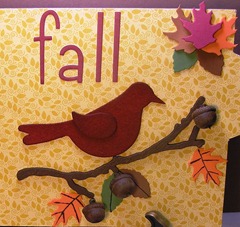
Here’s something a little different from what you normally see me create. I’m expanding my horizons (always a good thing to do) plus it’s my first project for Basically Bare! I started with one of their cardboard album pages as my base, covering it with some Bella Blvd paper.
I did a little experimenting. Since I wanted the chipboard house (BB Happy Houses) to have a brick look, I took a piece of acrylic and ran it through my Sizzix using the TH Checkerboard texture fade. Next I used several layers of Cranberry alcohol ink to give it a brick color. I cut it down to size and applied it with Glossy Accents. It’s still slightly transparent and the Glossy Accents dries crystal clear. I left the chipboard unpainted under the acrylic since it adds to the “brick effect” I was aiming for.
A Prima branch, some foam leaves from the Dollar Tree, acorns from my backyard, and a BB bird colored (how about SOAKED) with Dylusions and it’s done!
I hope you enjoyed! Until later…………………


The way you created that brick texture is brilliant! Storing that one away for future reference :)
ReplyDelete