NEVER NEVER NEVER choose Salvador Dali as you Favorite Artist on which to base ATCs. I spent nearly three weeks beating my head against a wall (figuratively) trying to finish 6 ATCs using his art as my theme. LOVE his paintings, HATE turning them into ATCs.
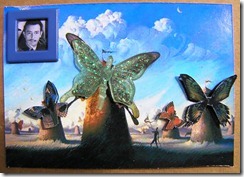
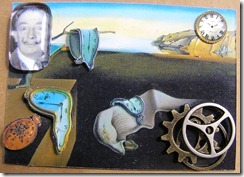
I’ll post the pictures but in this instance, I can honestly say the photos do not do the cards justice. These are not flat, printed pictures and nothing else. These have actually been turned into 3D ATCs. You just can’t see thanks to the camera. There’s no depth of field.
I literally could not think of anything else to do. Flowers, nope; ribbons, nope; metal embellishments, nope. NOTHING else worked. I did end up using some vintage pieces of jewelry and a few embellishments that seemed to fit the theme. Also, on several of the ATCs, you can see I used acrylic blocks in order to include a picture of the artist himself. In person, they look amazing. I used a 3-dimensional glue to adhere the picture to the acrylic. Gave it some depth so it doesn’t look like a picture slapped onto a piece of acrylic.
Anyway, here they are:
The four middle cards all have 3D effects that the camera turned into a flat picture. The top card is basically as you see it and so is the bottom card. I promise, they look much better in person than on this post. If they didn’t, I would not be sending them out to swap (I refuse to mail out crap)…..I would have redone every last one of them. All of the backgrounds pictures were printed on glossy photo paper, something I don’t recommend doing. While I sometimes like the effect the real photo look gives the ATC, working with photo paper is hard. It scratches very easily and doesn’t take well to glue removal – sometimes I’m a little too liberal with my glue application.
BTW……. when I took the pictures, the cards looked like they were laying flat. However, when I transferred them onto my computer, it became very obvious that they are not; they look bowed. How can you flatten the cards, especially when they are heavily embellished or 3D’d like mine? I would LOVE to know.
I do have to say this stretched my limits as an artist (ha ha, yeah, I call myself that sometimes). I’m pretty much a “vintage” look person. Working with something so modern was hard, caused me to think, and made me realize I need a bigger stash of embellishments and the like (anyone up for a little internet shopping?). Oh, and I was so stymied several times that my husband even tried to help me (shocker!).
So, on to the next challenge……Sherlock Holmes Inchies anyone? Oh yeah, I was the one that came up with that bright idea. Sigh. Stay tuned……………….


Wonderful ATC's! You met the challenge beautifully!
ReplyDeleteWell done, you did an amazing job! I enjoyed my visit to your sweet blog I am a new linky follower. Hugs and wishes for a beautiful week ahead.
ReplyDelete... but you made a fantastic job turning Dali's work into ATC's
ReplyDeleteoh my! these ATCs are marvelous! i would have ahard time parting with them if i made them. i love how you made them 3D and put all those little details. wonderful!
ReplyDeleteEnjoyed reading your blogs. Great work on the ATCs. You are very brave to show your workshop before pictures and the after pictures did inspired me to get more organized. Thank you. Also thank you for following my blog.
ReplyDeleteFelma